
Tuesday, 5 January 2016
Monday, 4 January 2016


Thursday, 3 December 2015
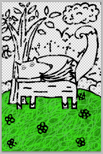
Colour Schemes
I quickly drew out a simple illustration of Alfy on a hill; this is the basis of what I coloured using three different colour schemes.


Local Colours
For this, I simply used colours that suited whatever I was colouring
(grass green, sun yellow etc). It looks happy and refreshing.

Cold Colours
For this, I used cooler colours such as blues and purples.
They are also less saturated and create an overall sad feel.

Warm Colours
This colour scheme gives it a happy feel. I used the colours
from the warm side of the colour wheel in order to create
this colour scheme.
Thursday, 26 November 2015
Publishing House Logo
To avoid copyright, I designed my own publishing house logo. It only took about 30 minutes and can be used over and over again in future designs.


I did a page of designs and chose my favourite.


Emulation
After copying the work of Brian Biggs, I chose to do one of my refined scamps in his style. I used the same techniques that I did when do "The Boy Who Cried Alien!" to recreate a design of my own.


I drew out the refined scamp using a thick whiteboard pen and "ate" away at the line with white acrylic paint in order to achieve the uneven line.


I chose to have a soft pink background and added the same texture that I used on the artist copy on top of the illustration.

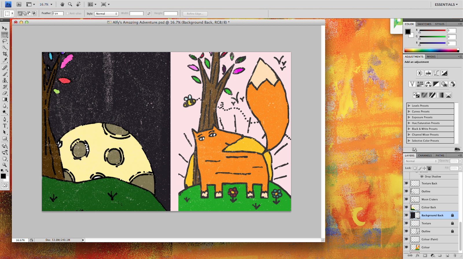
I coloured the back, included the texture and added a bright orange spine to separate the two illustrations.


I added the text and the finishing touches such as a barcode and a publishing house logo.


This is the final design. I will be refining this even further when doing my final piece.
Tuesday, 20 October 2015
Artist Copy
I chose to replicate Brian Biggs' style for my artist copy. Now that I have finished it, I will also try out one of my drafts in his style.


Thursday, 17 September 2015
Digital Type Annotations
After choosing my digital types off DaFont, I printed my fonts out and annotated them. I focused on things like the baseline, whether they are bold or not, the theme etc. Some of them aren't so nice after closer inspection, but a few would work perfectly on the front of my children's book.


Monday, 14 September 2015
Fonts
The font that I do on the cover of my book is really important. To make sure that I really got the font that is truly perfect, I drew a variety and scoured DaFont for suitable types. These will greatly aid me in the future when I am choosing a font for the cover.


These are the fonts that I chose after looking at DaFont. There is a range of thick and thin fonts to give it more variety when I come to choose one.


These are my pages of hand drawn type. I took inspiration from nature, as this is a nature-themed book, and really like the way it turned out.

Wednesday, 9 September 2015
Contact Sheet
My contact sheet displays all the photographs that I took. I circled the ones that I found useful and crossed out the ones that weren't. I went to a woodland area near me to take the pictures and really like the way that they have turned out. Some of them didn't turn out so well, so I crossed them off, however some of them worked really well and will prove to be helpful to me when designing the front cover of my children's book.


Drafting
Drafting is my next bit of research. I chose my favourite idea and refined it. I really like the outcome after the refinement but I will probably change it as I progress with the task and more ideas come into my head.


Wednesday, 1 July 2015
Scamping
My next bit of research is scamping. I did two sets of scamps; one is copies of other children's book covers, and the other is my own ideas that are inspired by other peoples work.


Here are my scamps of other peoples work. I went on Pinterest and copied children's book covers. These were very useful when doing my own ideas as I used them as inspiration.


These are my scamps of my own ideas- inspired by the scamps of other peoples work. I will be further refining some of these ideas that I might like to use as my final piece of work.

Sunday, 21 June 2015
Primary Sketches
My research is still continuing; this time, with primary sketches of woodland animals. I found the primary sketches particularly difficult as it is 'stepping out of my comfort zone'. However, I am happy with the outcome of the four pages that I have done.


On the first three pages, I used a normal HB pencil, drawing a range of animals and plants that you would find in a woodland habitat.
On the final page, I used a range of medias, such as oil pastels, charcoal and biro. This displays that I can use different medias and still achieve the desired effect.
I am really happy with how these pages have turned out. They have greatly benefitted me as I have learned the basic shapes of animals that will help me when drawing secondary drawings for my book cover.
Subscribe to:
Comments (Atom)