After copying the work of Brian Biggs, I chose to do one of my refined scamps in his style. I used the same techniques that I did when do "The Boy Who Cried Alien!" to recreate a design of my own.
I drew out the refined scamp using a thick whiteboard pen and "ate" away at the line with white acrylic paint in order to achieve the uneven line.
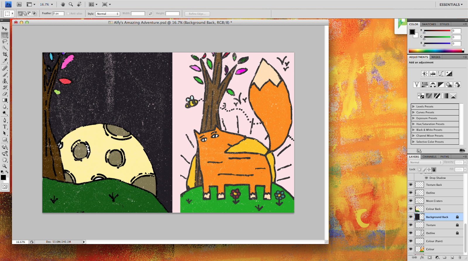
I chose to have a soft pink background and added the same texture that I used on the artist copy on top of the illustration.
I coloured the back, included the texture and added a bright orange spine to separate the two illustrations.
I added the text and the finishing touches such as a barcode and a publishing house logo.
This is the final design. I will be refining this even further when doing my final piece.